
Staring at a blank page is the slowest way to make an ad. Almost every ad that keeps running for months is a strong version of a format you have seen a hundred times: a founder talking to camera, a side-by-side comparison, a stack of reviews, a before-and-after, a bold offer card.
A format is a reusable structure: what the viewer sees first, what happens next, and how it ends. The product, the words and the people change; the structure stays. That is good news, because a structure can be copied without copying anyone's ad.
This teardown covers 50 formats that keep showing up in long-running ads. For each one you get what it is, why it works, a fill-in-the-blanks hook line, the products it suits, what to shoot or make, and the mistake that most often ruins it. Then we show you how to find live examples of any format yourself in the Meta Ad Library, and how to test formats without wasting money.
The swipe file workbook has all 50 formats with filters (group, effort, product type), a "My tests" tracker that calculates hook rate, CTR, CPA and ROAS for every ad you run, a scorecard by format, and a log for examples you find in the Ad Library.
What "keeps winning" means here, and what it doesn't
We are not going to tell you that a named brand made a certain amount of money from a certain ad. We can't verify that, and neither can anyone outside that brand. What we can say is that these structures recur again and again among ads that advertisers keep paying to run, and among the 60,000+ ads GaaS has made for businesses.
That makes this a list of strong starting points, not a ranking. No format works for every product. The only way to know which ones work for yours is to test them, which is what the workbook's tracker is for.
A few words we use throughout:
- Hook: the first 1 to 3 seconds of a video, or the headline of a static ad. Its job is to stop the scroll.
- Hook rate: 3-second video plays divided by impressions. The share of people who watched past the opening.
- UGC: user-generated content. Video made by customers or creators rather than by the brand.
- CTR: click-through rate. Link clicks divided by impressions.
- CPA and ROAS: cost per acquisition (spend divided by purchases) and return on ad spend (revenue divided by spend).
The map: what to make first
We scored each format from 1 to 5 on production effort (1 = one person with a phone in under an hour; 5 = a crew, several locations or weeks of filming) and speed to test (5 = you can launch it today). These are our editorial scores, not measurements, but they make one thing obvious.
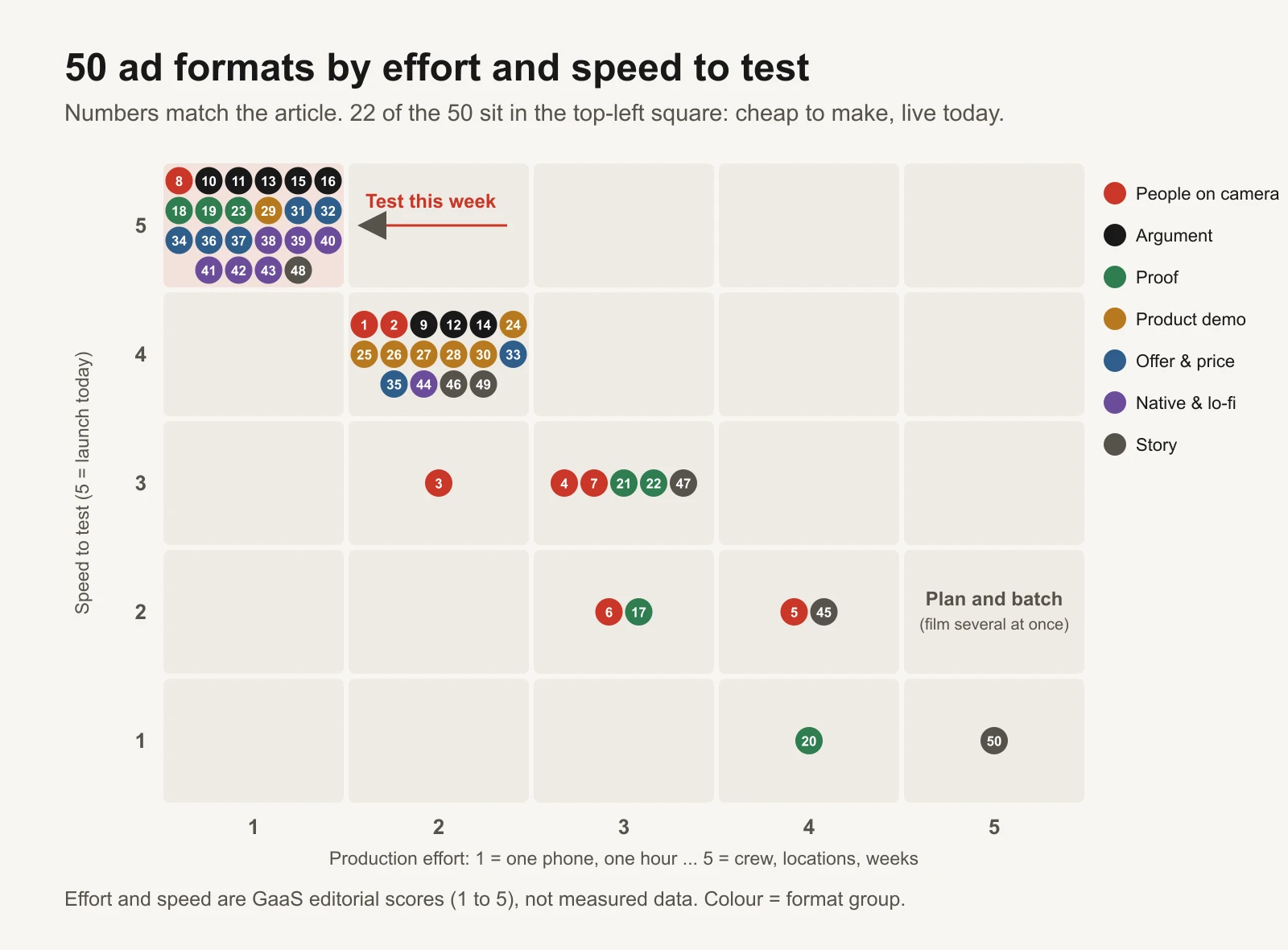
22 of the 50 formats can be made by one person in under an hour. Start there; save the crew shoots for formats that have already proved themselves in cheap versions.
If you only have time for five, here is where we would start by product type. Every pick suits that product type in the swipe file.
| Your product | Five formats to try first | Why these |
|---|---|---|
| Physical product (gadget, homeware, apparel) | 29 hands-only demo, 22 side-by-side test, 24 unboxing, 9 us vs them, 18 review stack | Show it working, then prove it |
| Consumable or repeat buy (food, skincare, supplements) | 3 UGC testimonial, 20 results timeline, 28 what's inside, 37 cost per use, 33 bundle builder | Trust in the result, then a reason to restock |
| High-ticket item | 2 founder explains the price, 6 expert explainer, 16 objection handler, 36 guarantee-led, 50 customer mini-documentary | Answer the price and risk worries head-on |
| Service or lead generation | 1 founder story, 7 podcast clip, 11 myth vs fact, 12 problem-agitate-solve, 50 customer mini-documentary | People buy the person and the expertise |
| App or software | 8 green screen reaction, 26 how-to tutorial, 9 us vs them, 38 notes app list, 44 POV skit | Show the screen and the moment it helps |
Anatomy: which part of an ad each format fixes
Most short video ads have the same five parts: a hook, a problem, proof or a demo, an offer and an ask. Most formats are an especially strong version of one of those parts. So the useful question is not "which format is best?" but "which part of my current ads is weakest?"
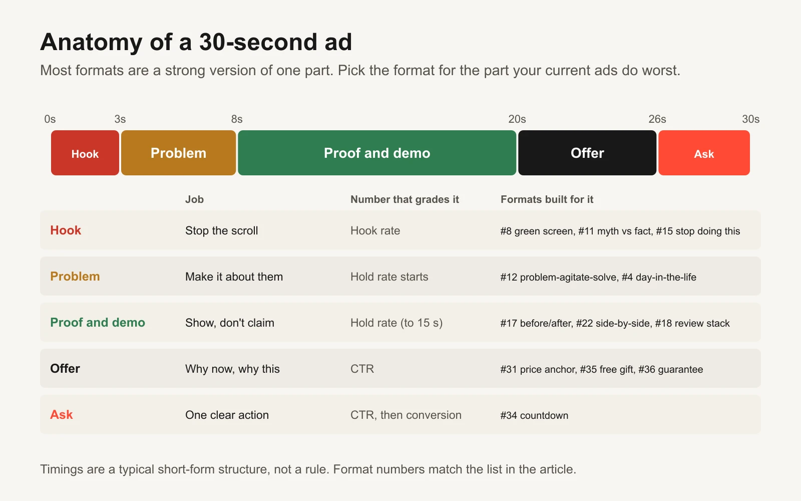
If your hook rate is low, try hook-led formats. If people watch but don't click, try offer formats. Your numbers tell you which part to fix.
How to find live examples in the Meta Ad Library
Before you shoot anything, look at how other advertisers are using the format right now. The Meta Ad Library shows active ads running across Facebook, Instagram and Meta's other apps, and you don't need an ad account to browse it.
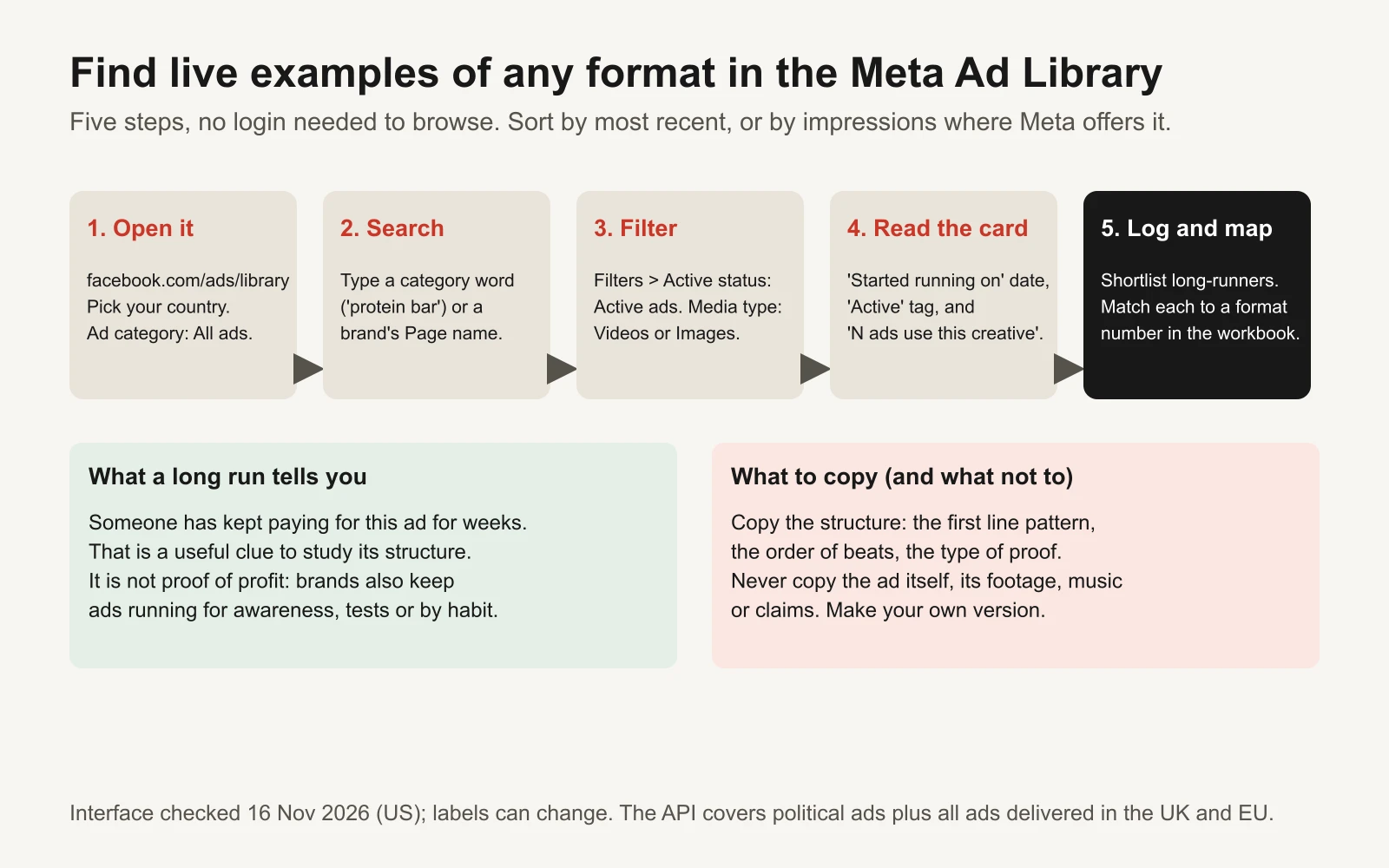
Interface checked on 16 November 2026 in the US. Meta changes labels from time to time.
- Open it and set the basics. Go to facebook.com/ads/library, choose your country and set the ad category to "All ads".
- Search. Type a category word ("protein bar", "dog bed", "bookkeeping") to see what everyone in your space runs, or a specific brand's Page name to study one advertiser.
- Filter. Open Filters. Set active status to active ads so you only see what is running now, and set media type to videos or images depending on the format you are researching. You can also sort the results; options we saw included most recent, and impressions from high to low.
- Read each card. Every ad shows an "Active" tag, the date it "Started running on", and often a line saying how many ads use the same creative and text. An ad that started months ago and is still active is one somebody keeps choosing to pay for. Several versions of the same creative suggest the advertiser is testing variations of something that works.
- Log and map it. In the workbook's Ad Library log, record the date you found it, the date it started running (the sheet works out how many days it has run), and the closest format number. Write down the first line or first frame and the structural idea you want to borrow.
Two honest caveats. Run time is a clue, not proof: brands keep ads running for awareness, for tests that haven't been read yet, or simply because nobody turned them off. And study the structure, never copy the ad: its footage, music, words and claims belong to someone else.
Two other free libraries are worth a look for the same research: Google's Ads Transparency Center for Search, YouTube and Display ads, and TikTok's Creative Center top ads for short-form video.
The 50 formats
Each format below has the same six parts. Hook templates use square brackets for the parts you fill in. Effort and speed are our 1-to-5 editorial scores from the map above.
People on camera (formats 1 to 8)
A real person talking to the viewer. These formats borrow trust from a face and a voice, which matters most for new brands and anything people worry about buying.
1. Founder-to-camera story
What it is: The founder talks straight to a phone camera about the moment that made them start the business. Why it works: People trust a person more than a logo. A real face and a specific origin story make a small brand feel accountable.
- Hook line template: "I started [brand] because [specific frustrating moment]."
- Best for: New brands, trust-heavy categories (skincare, supplements, services), anything with a real origin story.
- What to shoot or make: One phone, eye level, window light, 30 to 60 seconds. Cut to product shots every few seconds and burn in captions.
- Common mistake: Opening with 'Hi, I'm…' and the brand name. The first 3 seconds should be the frustration, not the introduction.
- Effort: 2 of 5. Speed to test: 4 of 5.
2. Founder explains the price
What it is: The founder walks through why the product costs what it costs: materials, process, what was left out. Why it works: It answers the biggest silent objection (price) out loud. Transparency reads as confidence.
- Hook line template: "Here's why our [product] costs $[X], not $[cheaper price]."
- Best for: Premium-priced products and services.
- What to shoot or make: Founder at the workbench, kitchen or desk, holding the parts. Show the cost breakdown as on-screen text.
- Common mistake: Attacking cheaper competitors by name. Explain your choices instead of their shortcuts.
- Effort: 2 of 5. Speed to test: 4 of 5.
3. UGC testimonial
What it is: A real customer, or a creator who has genuinely used the product, tells the camera what changed for them. UGC means user-generated content. Why it works: A peer voice. Viewers hear their own problem described by someone like them.
- Hook line template: "I didn't think a [product type] would fix my [specific problem]. Then…"
- Best for: Most consumer products; services with a relatable 'before'.
- What to shoot or make: Brief creators with the problem, 3 points to cover and the claims they must not make. Ask for 3 different first lines.
- Common mistake: Over-scripting until it sounds like an ad read, or letting creators make claims you can't back up.
- Effort: 2 of 5. Speed to test: 3 of 5.
4. UGC day-in-the-life
What it is: A creator films a normal day and the product shows up where it naturally fits. Why it works: It shows the product in context without a pitch, so viewers picture it in their own routine.
- Hook line template: "A day in my life as a [specific identity], and the one thing I never skip."
- Best for: Everyday consumables, apparel, wellness, apps.
- What to shoot or make: 6 to 10 short clips from morning to night, product in 2 or 3 moments, voiceover recorded afterwards.
- Common mistake: The product appears too late or too briefly. Show it in the first 5 seconds.
- Effort: 3 of 5. Speed to test: 3 of 5.
5. Street interview
What it is: Someone with a microphone asks strangers a question about the problem your product solves. Why it works: It looks like organic content, uses real faces and creates curiosity about the answers.
- Hook line template: "We asked strangers how much they spend on [category] every month."
- Best for: Products with a common, relatable problem; broad consumer products; apps.
- What to shoot or make: A handheld or clip-on mic, a signed release from everyone who appears, 10 to 20 interviews cut down to 3 to 5.
- Common mistake: Staged answers that feel fake, or filming people without signed releases.
- Effort: 4 of 5. Speed to test: 2 of 5.
6. Expert explainer
What it is: Someone with relevant credentials (a dermatologist, mechanic or accountant) explains the problem and how your approach works. Why it works: Borrowed authority. It educates before it sells.
- Hook line template: "As a [profession], here's the one thing I'd tell anyone with [problem]."
- Best for: Health-adjacent, technical and high-consideration products; B2B.
- What to shoot or make: A real expert under a written agreement, explaining the mechanism with props or a whiteboard. Check every claim with your compliance rules.
- Common mistake: Using a lab coat or 'doctor' framing without a real credentialed person. That misleads viewers and can break ad policies.
- Effort: 3 of 5. Speed to test: 2 of 5.
7. Podcast-style clip
What it is: Two people at microphones discussing a problem; a 20 to 40 second clip where your product or idea comes up. Why it works: It looks like content people already choose to watch, and the second voice can raise objections and get answers.
- Hook line template: "Wait, so you're saying [surprising fact about the category]?"
- Best for: Services, B2B, courses, higher-ticket products, software.
- What to shoot or make: Two mics and one wide shot (or two cameras). Record 20 minutes and cut 5 to 10 clips with speaker-labelled captions.
- Common mistake: Turning it into a monologue. The format works because one person pushes back.
- Effort: 3 of 5. Speed to test: 3 of 5.
8. Green screen reaction
What it is: A creator stands in front of a screenshot (a review, a chart, a product page) and reacts or explains. Why it works: The background gives instant context, and it reads as a person commenting rather than a brand selling.
- Hook line template: "This review changed how I think about [category]. Let me explain."
- Best for: Products with strong reviews or a newsworthy angle; apps and software (show the screen).
- What to shoot or make: The green screen effect in TikTok or CapCut, or a simple overlay in any editor. One take.
- Common mistake: Reacting to other people's content without rights, or to a review that isn't real.
- Effort: 1 of 5. Speed to test: 5 of 5.
Argument and comparison (formats 9 to 16)
Formats that make a case. They work best on people who already know they have the problem and are weighing their options.
9. Us vs them
What it is: A split screen or two columns: your product against 'the usual way' of solving the problem. Why it works: Contrast is readable in 2 seconds and frames the choice for the viewer.
- Hook line template: "[The usual way] vs [your way]: one of these takes [20 minutes / $X a month]."
- Best for: Products that replace a habit or a category default.
- What to shoot or make: Same angle and lighting for both sides, 3 to 5 comparison beats.
- Common mistake: Naming a competitor and making claims you can't prove. Compare against 'the usual way' instead.
- Effort: 2 of 5. Speed to test: 4 of 5.
10. Comparison table
What it is: A static image or carousel with feature rows and checkmarks for your product against the alternatives. Why it works: Shoppers compare anyway. You do the work for them.
- Hook line template: "Why people switch to [product]: the side-by-side."
- Best for: Considered purchases with clear feature differences.
- What to shoot or make: 4 to 6 rows at most, large type, your column highlighted, readable on a phone.
- Common mistake: Too many rows to read on a phone, or rows that only matter to you.
- Effort: 1 of 5. Speed to test: 5 of 5.
11. Myth vs fact
What it is: State a common belief in your category, then correct it. Why it works: Correcting a belief creates a small 'aha' and positions you as the expert.
- Hook line template: "Myth: [common belief]. Fact: [correction]."
- Best for: Categories full of outdated advice (skincare, fitness, finance, home).
- What to shoot or make: Talking head or text cards, 2 or 3 myths per ad.
- Common mistake: 'Facts' you can't back up. Keep a source for every one.
- Effort: 1 of 5. Speed to test: 5 of 5.
12. Problem-agitate-solve
What it is: Name the problem, make its cost vivid (agitate), then show the product as the fix. Often shortened to PAS. Why it works: The classic direct-response structure: the right viewer self-selects in the first line.
- Hook line template: "If you [specific symptom of the problem], it's not your fault."
- Best for: Pain-point products and services.
- What to shoot or make: Three beats: problem (0 to 3 seconds), what it costs them (3 to 10 seconds), the fix with a demo.
- Common mistake: Agitating for so long that viewers leave before the product appears. Show the fix by second 10.
- Effort: 2 of 5. Speed to test: 4 of 5.
13. 3 reasons
What it is: Numbered reasons to buy or switch, each one a short beat. Why it works: A number promises a short, finite watch and gives the ad an obvious structure.
- Hook line template: "3 reasons [audience] are switching to [product type]."
- Best for: Products with several distinct benefits.
- What to shoot or make: One clip or graphic per reason. Put your strongest reason first.
- Common mistake: Saving the best reason for last. Many viewers never get there.
- Effort: 1 of 5. Speed to test: 5 of 5.
14. Listicle: things I wish I knew
What it is: A list of genuinely useful tips about the category, with your product as one of them. Why it works: It is valuable on its own, so it earns attention before the pitch.
- Hook line template: "5 things I wish I knew before [buying a / starting] [category]."
- Best for: Categories with a learning curve (coffee gear, skincare routines, DIY, software).
- What to shoot or make: Talking head or text over product footage, 3 to 5 seconds per tip.
- Common mistake: Filler tips around one obvious product plug. Make every tip useful.
- Effort: 2 of 5. Speed to test: 4 of 5.
15. Stop doing this
What it is: Open with a common mistake the viewer is probably making, then show the better way. Why it works: A pattern interrupt plus a small fear of doing it wrong.
- Hook line template: "Stop [common action] if you want [outcome]."
- Best for: Products that fix a common habit.
- What to shoot or make: Show the mistake first, then the right way with the product.
- Common mistake: Shaming the viewer. Keep the tone helpful.
- Effort: 1 of 5. Speed to test: 5 of 5.
16. Objection handler
What it is: Say the doubt out loud ('Is it worth $90?') and answer it honestly. Why it works: It tackles the reason people don't buy. Especially useful for retargeting people who already visited.
- Hook line template: "'Is [product] really worth $[X]?' Here's the honest answer."
- Best for: Retargeting, premium items, subscriptions.
- What to shoot or make: Pull objections from reviews, support tickets and comments. One objection per ad.
- Common mistake: Answering a doubt nobody has. Use the questions your support inbox actually gets.
- Effort: 1 of 5. Speed to test: 5 of 5.
Proof (formats 17 to 23)
Show the result, or let other people vouch for it. Proof formats are strongest for sceptical buyers and in retargeting, where people already know you and need a reason to believe.
17. Before and after
What it is: The same subject before and after using the product. Why it works: The outcome is visible in one frame.
- Hook line template: "Day 1 vs day [30] using [product]."
- Best for: Cleaning, home, beauty, renovation and other visual results.
- What to shoot or make: Same angle, light and framing for both shots. Real, unedited results with dates.
- Common mistake: Edited or misleading results. Some categories (weight loss, many health claims) have strict before-and-after rules, so check Meta's and Google's policies first.
- Effort: 3 of 5. Speed to test: 2 of 5.
18. Review stack
What it is: Several real customer reviews shown one after another as text cards, screenshots or a voiceover. Why it works: Volume of proof, and each reviewer can answer a different doubt.
- Hook line template: "We asked customers what they'd tell a friend. Here's what they said."
- Best for: Products with plenty of genuine reviews.
- What to shoot or make: Pick 5 to 7 real reviews that each answer a different objection. Get permission to show names or initials.
- Common mistake: Invented or edited reviews. In the US, the FTC's consumer review rule bans fake reviews and testimonials.
- Effort: 1 of 5. Speed to test: 5 of 5.
19. Press and badge bar
What it is: An opener or static showing real press mentions, awards or certifications. Why it works: Third-party credibility in one glance.
- Hook line template: "Featured in [real publication]. Here's what they tested."
- Best for: Brands with genuine coverage, awards or certifications.
- What to shoot or make: Use logos and quotes only where coverage really exists and you are allowed to use them.
- Common mistake: Implying an endorsement the outlet never gave.
- Effort: 1 of 5. Speed to test: 5 of 5.
20. Results timeline
What it is: Progress over time: day 1, week 2, week 6. Why it works: It sets realistic expectations and makes the result feel earned.
- Hook line template: "What [8] weeks of [using product] actually looks like."
- Best for: Products with gradual results (skincare, plants, fitness, learning apps).
- What to shoot or make: Diary-style clips filmed over the real period. Start filming early.
- Common mistake: Compressing the timeline so results look faster than they are.
- Effort: 4 of 5. Speed to test: 1 of 5.
21. Torture test
What it is: Put the product through extreme use: drop it, soak it, overload it. Why it works: Spectacle plus proof of durability.
- Hook line template: "We tried to break our [product]. [Number] tests later…"
- Best for: Durable goods: tools, bags, cases, outdoor gear.
- What to shoot or make: 3 to 5 escalating tests in real, uncut footage.
- Common mistake: Cutting away at the key moment. It looks faked and destroys the proof.
- Effort: 3 of 5. Speed to test: 3 of 5.
22. Side-by-side test
What it is: The same task done with your product and a generic alternative at the same time. Why it works: Viewers judge with their own eyes.
- Hook line template: "Same [mess / task], two [tools]. Watch the left one."
- Best for: Cleaning, kitchen, beauty, tools, software speed.
- What to shoot or make: A synchronised split screen with identical conditions on both sides.
- Common mistake: An unfair setup (different amounts, angles or lighting). Viewers notice.
- Effort: 3 of 5. Speed to test: 3 of 5.
23. One-number proof card
What it is: A static image built around one specific, documented fact (delivery time, ingredient count, review average). Why it works: Specifics beat adjectives.
- Hook line template: "[Specific true number] + [what it means for the buyer]."
- Best for: Products with a strong, provable fact.
- What to shoot or make: One number in huge type, the source in small type.
- Common mistake: Rounding up, cherry-picking, or a number you can't document.
- Effort: 1 of 5. Speed to test: 5 of 5.
Product demo (formats 24 to 30)
Let the product do the talking. Best when the product is visual, tactile or clever, and the quickest way to answer 'what is it and does it work?'
24. Unboxing
What it is: Opening the package, the first look and the first use. Why it works: Anticipation, and it shows exactly what the buyer receives.
- Hook line template: "Opening my [product] order: here's everything inside."
- Best for: Gifts, premium packaging, kits and bundles (strong in Q4).
- What to shoot or make: Overhead or first-person shot on a clean surface, natural sound.
- Common mistake: A slow start. Get to the product within 3 seconds.
- Effort: 2 of 5. Speed to test: 4 of 5.
25. Satisfying sound demo
What it is: Close, sound-forward footage of the product doing its job: pouring, cutting, cleaning, clicking. Often called ASMR. Why it works: Sensory and rewatchable.
- Hook line template: "Open on the most satisfying moment. Text: 'Wait for it…'"
- Best for: Tactile products: food, cleaning, beauty, stationery.
- What to shoot or make: Phone macro close-ups, a decent mic, a quiet room.
- Common mistake: Music drowning out the sounds that make it satisfying.
- Effort: 2 of 5. Speed to test: 4 of 5.
26. How-to tutorial
What it is: Step-by-step use of the product to get a result. Why it works: It removes the 'will I know how to use it?' doubt and is useful even to people who don't buy.
- Hook line template: "How to [result] in [N] steps, without [common pain]."
- Best for: Products with a technique (cosmetics, recipes, tools, software).
- What to shoot or make: Numbered on-screen steps, hands visible, 30 to 60 seconds.
- Common mistake: Skipping the step real customers struggle with.
- Effort: 2 of 5. Speed to test: 4 of 5.
27. Macro detail
What it is: Extreme close-ups of materials, texture, stitching or ingredients. Why it works: Quality is shown, not claimed.
- Hook line template: "Look closer. This is why [product] [lasts / feels different]."
- Best for: Apparel, furniture, food, beauty, jewellery.
- What to shoot or make: A clip-on macro lens and side lighting.
- Common mistake: Beautiful shots with no context. Say why the detail matters to the buyer.
- Effort: 2 of 5. Speed to test: 4 of 5.
28. What's inside breakdown
What it is: The product taken apart, or its ingredients laid out with labels. Why it works: Transparency that supports the price and the claims.
- Hook line template: "What's actually inside a $[X] [product]?"
- Best for: Supplements, food, electronics, skincare, subscription boxes.
- What to shoot or make: A flat lay with animated labels.
- Common mistake: Listing parts without saying why each one matters to the buyer.
- Effort: 2 of 5. Speed to test: 4 of 5.
29. Hands-only POV demo
What it is: First-person footage of hands using the product, no face. POV means point of view. Why it works: Viewers see it as if they were using it, and it is easy to produce in volume.
- Hook line template: "POV: you finally found a [product] that [does the hard thing]."
- Best for: Almost any physical product; apps shown on a phone in hand.
- What to shoot or make: Phone mounted on the chest or over the shoulder, clean background.
- Common mistake: Shaky footage and a cluttered background.
- Effort: 1 of 5. Speed to test: 5 of 5.
30. Use it 3 ways
What it is: Several real uses for one product. Why it works: It raises perceived value and widens the audience.
- Hook line template: "One [product], 3 ways to use it. Number 3 surprised me."
- Best for: Versatile products: sauces, apparel, multi-tools, kitchen gear.
- What to shoot or make: Three quick scenes, each in a different context.
- Common mistake: Uses that are a stretch. Every one should be real.
- Effort: 2 of 5. Speed to test: 4 of 5.
Offer and price (formats 31 to 37)
Formats about the deal. They rarely create interest on their own, but they close people who are already interested, which is why they matter in sale periods and retargeting.
31. Price anchor
What it is: Compare your price with a bigger, familiar number: the alternative, the old way, the monthly cost. Why it works: A price feels smaller next to a relevant reference.
- Hook line template: "[Alternative] costs $[X]. This costs $[Y]."
- Best for: Premium items that replace a recurring cost; services; subscriptions.
- What to shoot or make: Two prices in large type and a one-line explanation.
- Common mistake: A reference price that isn't comparable or genuine. US rules (16 CFR 233) require former-price comparisons to be real prices.
- Effort: 1 of 5. Speed to test: 5 of 5.
32. Offer card
What it is: A bold static image: product, offer and deadline. Why it works: Clear for people already close to buying. Strong in retargeting and sale periods.
- Hook line template: "[X]% off [category]. Ends [day]."
- Best for: Sales, retargeting, Black Friday and Cyber Monday.
- What to shoot or make: Product photo, offer in huge type, one line of terms. Make 1:1, 4:5 and 9:16 versions.
- Common mistake: Too much text, or a deadline that isn't real.
- Effort: 1 of 5. Speed to test: 5 of 5.
33. Bundle builder
What it is: A curated set ('starter kit', 'the full routine') with the combined saving. Why it works: It raises order value and solves 'which one should I get?'
- Hook line template: "Everything you need to [result], in one box."
- Best for: Product lines with complementary items.
- What to shoot or make: A flat lay built up item by item, then the total vs the bundle price.
- Common mistake: Bundling slow sellers nobody wants.
- Effort: 2 of 5. Speed to test: 4 of 5.
34. Countdown and deadline
What it is: The ad is about time: hours left, last shipping day, sale ends. Why it works: A real deadline moves people who were already considering.
- Hook line template: "Last day to [get the offer / order for delivery by date]."
- Best for: Sales, launches, shipping cutoffs.
- What to shoot or make: A timer graphic, new creative each day, ads scheduled to stop on time.
- Common mistake: Fake urgency, such as a sale that 'ends' and never ends. It erodes trust and can be unlawful.
- Effort: 1 of 5. Speed to test: 5 of 5.
35. Free gift reveal
What it is: Show exactly what the free gift with purchase is. Why it works: A gift can feel worth more than the same-cost discount and protects your price.
- Hook line template: "Every order this week comes with [gift]. Here's what it looks like."
- Best for: Brands with a low-cost, high-perceived-value extra item.
- What to shoot or make: Product plus gift on camera, the gift's value shown only if it is honest.
- Common mistake: Not doing the margin maths. A gift still costs money on every order.
- Effort: 2 of 5. Speed to test: 4 of 5.
36. Guarantee-led
What it is: Lead with the risk reversal: free returns, money-back, free trial. Why it works: It removes risk, often the last barrier for a first-time customer.
- Hook line template: "Try it for [30] days. If it doesn't [result], we'll refund you."
- Best for: New brands, higher prices, subscriptions, services.
- What to shoot or make: Founder or text. Explain the exact terms in plain words.
- Common mistake: Fine print that contradicts the ad.
- Effort: 1 of 5. Speed to test: 5 of 5.
37. Cost per use
What it is: Divide the price by uses or days. Why it works: It turns a big number into a small everyday one.
- Hook line template: "This [product] costs $[X] a [day / use]. Here's the maths."
- Best for: Durable goods, subscriptions, consumables, software.
- What to shoot or make: Simple maths on screen.
- Common mistake: Unrealistic usage assumptions.
- Effort: 1 of 5. Speed to test: 5 of 5.
Native and lo-fi (formats 38 to 44)
Ads designed to look like ordinary posts rather than ads. Cheap and fast to make. Watch the policy lines: nothing that pretends to be a real person's private message, and nothing that looks tappable when it isn't.
38. Notes app list
What it is: An image or video styled like a phone's notes app, with a short list or confession. Why it works: It looks personal and reads like a friend's tip.
- Hook line template: "Things I stopped buying after I found [product]:"
- Best for: Consumer products, apps, simple services.
- What to shoot or make: A real notes-app screenshot or a faithful recreation, short list.
- Common mistake: Writing it like an ad. Keep the personal voice.
- Effort: 1 of 5. Speed to test: 5 of 5.
39. Text-message chat
What it is: A chat-style exchange between two clearly fictional friends recommending the product. Why it works: Social proof in a format everyone reads instantly.
- Hook line template: "ok what was the [thing] you told me about??"
- Best for: Gifts, consumer products, apps, local services.
- What to shoot or make: Design your own chat layout. Never use real people's names or photos without consent.
- Common mistake: Fake buttons or tappable-looking elements. Meta's ad standards ban images that show functionality that doesn't exist.
- Effort: 1 of 5. Speed to test: 5 of 5.
40. Social post style
What it is: An image made to look like a post with a strong opinion or tip, from your own account. Why it works: Native look, and opinions get read.
- Hook line template: "Unpopular opinion: [category belief] is a waste of money."
- Best for: Opinionated brands, B2B, apps.
- What to shoot or make: Your own brand or founder account; no invented engagement numbers.
- Common mistake: Fake likes or shares, or impersonating a real account.
- Effort: 1 of 5. Speed to test: 5 of 5.
41. Forum question
What it is: Open with a question as if asked in a community ('Has anyone found…?'), then answer it. Why it works: It mirrors how people research, and the viewer answers it in their head.
- Hook line template: "Has anyone actually found a [product type] that [does the hard thing]?"
- Best for: Considered purchases.
- What to shoot or make: Your own designed question card, then the answer with proof.
- Common mistake: Faking a real community post or a real user.
- Effort: 1 of 5. Speed to test: 5 of 5.
42. Meme
What it is: A familiar meme structure adapted to your customer's problem. Why it works: Instantly understood and shareable.
- Hook line template: "Me before [product] / me after [product]."
- Best for: Playful brands, younger audiences, apps.
- What to shoot or make: Use templates you have rights to, or make your own. One joke, one product.
- Common mistake: Copyrighted images, stale memes, or a joke unrelated to the product.
- Effort: 1 of 5. Speed to test: 5 of 5.
43. Handwritten note
What it is: A handwritten note, sticky note or whiteboard message. Why it works: A human, low-polish look stands out among glossy ads.
- Hook line template: "Read this before you buy another [category]."
- Best for: Small brands, gifting, services.
- What to shoot or make: Real handwriting, phone photo, good light.
- Common mistake: Handwriting that is unreadable on a phone screen.
- Effort: 1 of 5. Speed to test: 5 of 5.
44. POV skit caption
What it is: A short scene captioned 'POV: you…' that puts the viewer in a situation. Why it works: Native to short-form video and creates quick empathy.
- Hook line template: "POV: you [relatable situation] and [product] saves you."
- Best for: Consumer products, apps, local services.
- What to shoot or make: 5 to 15 seconds, one location, one actor.
- Common mistake: A joke that doesn't involve the product.
- Effort: 2 of 5. Speed to test: 4 of 5.
Story and entertainment (formats 45 to 50)
Entertainment first, pitch second. Higher effort, but a good story can run for months without wearing out.
45. Skit or mini-drama
What it is: A scripted 20 to 60 second scene with characters and a problem the product resolves. Why it works: Story holds attention, and entertainment earns the pitch.
- Hook line template: "Start mid-argument: 'You did WHAT with my [item]?'"
- Best for: Situational problems: home, pets, parenting, apps.
- What to shoot or make: Two actors, a simple script, 3 to 5 shots.
- Common mistake: The product appears only in the last second.
- Effort: 4 of 5. Speed to test: 2 of 5.
46. Things that just make sense
What it is: A quick montage of clever little moments, with your product as one or all of them. Why it works: A satisfying rhythm and an 'of course!' feeling.
- Hook line template: "Things that just make sense: [first clever moment]."
- Best for: Clever designs, household products, gadgets.
- What to shoot or make: 5 to 8 clips of 1 to 2 seconds each, with music.
- Common mistake: Burying your product among other brands' products.
- Effort: 2 of 5. Speed to test: 4 of 5.
47. How it's made
What it is: Footage of production, the workshop, or the team packing orders. Why it works: Craft and real people build trust and support the price.
- Hook line template: "This is how one [product] gets made, start to finish."
- Best for: Handmade, local, small-batch and premium products.
- What to shoot or make: Real process footage with narration over the key steps.
- Common mistake: Too long, with no reason to buy at the end.
- Effort: 3 of 5. Speed to test: 3 of 5.
48. Gift guide
What it is: A carousel or video of gift ideas for a specific person, featuring your products. Why it works: It matches how people shop in Q4 and answers 'what do I get them?'
- Hook line template: "Gifts for [the friend who's always cold] under $[50]."
- Best for: Q4 and gifting holidays.
- What to shoot or make: A carousel with one product per card and the price on each.
- Common mistake: Generic recipients. Be specific.
- Effort: 1 of 5. Speed to test: 5 of 5.
49. Trend adaptation
What it is: A current trend (audio, format or challenge) reworked with your product. Why it works: It rides existing attention patterns and feels current.
- Hook line template: "Depends on the trend. Keep its first beat, swap in your product."
- Best for: Brands active on TikTok and Reels, younger audiences.
- What to shoot or make: Move fast. Use audio from a library licensed for commercial use.
- Common mistake: Trending audio that isn't licensed for ads, or arriving after the trend is stale.
- Effort: 2 of 5. Speed to test: 4 of 5.
50. Customer mini-documentary
What it is: A 60 to 120 second story of one real customer: their situation, decision and result. Why it works: Depth and emotion for high-consideration purchases.
- Hook line template: "[Name] almost [gave up on X]. Then…"
- Best for: Services, B2B, high-ticket, mission-driven brands.
- What to shoot or make: An interview plus footage at the customer's location, with a signed release.
- Common mistake: Too polished and corporate, with a slow intro.
- Effort: 5 of 5. Speed to test: 1 of 5.
Which groups fit which products
The swipe file marks each format as a fit (or not) for five product types. Counting those marks by group gives a quick sense of where to look first.
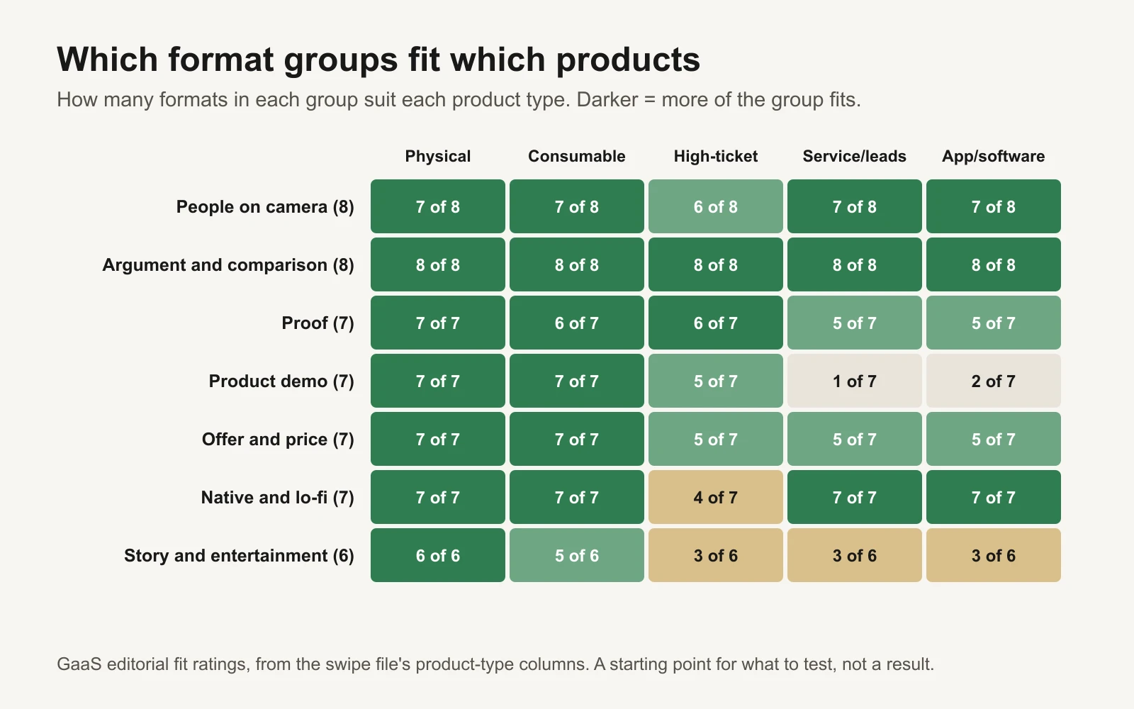
Argument and comparison formats fit almost anything. Product demos are mostly for physical products.
How to test formats without wasting money
A format test asks one question: does this structure work for my product? Keep everything else as steady as you can, so the answer means something.
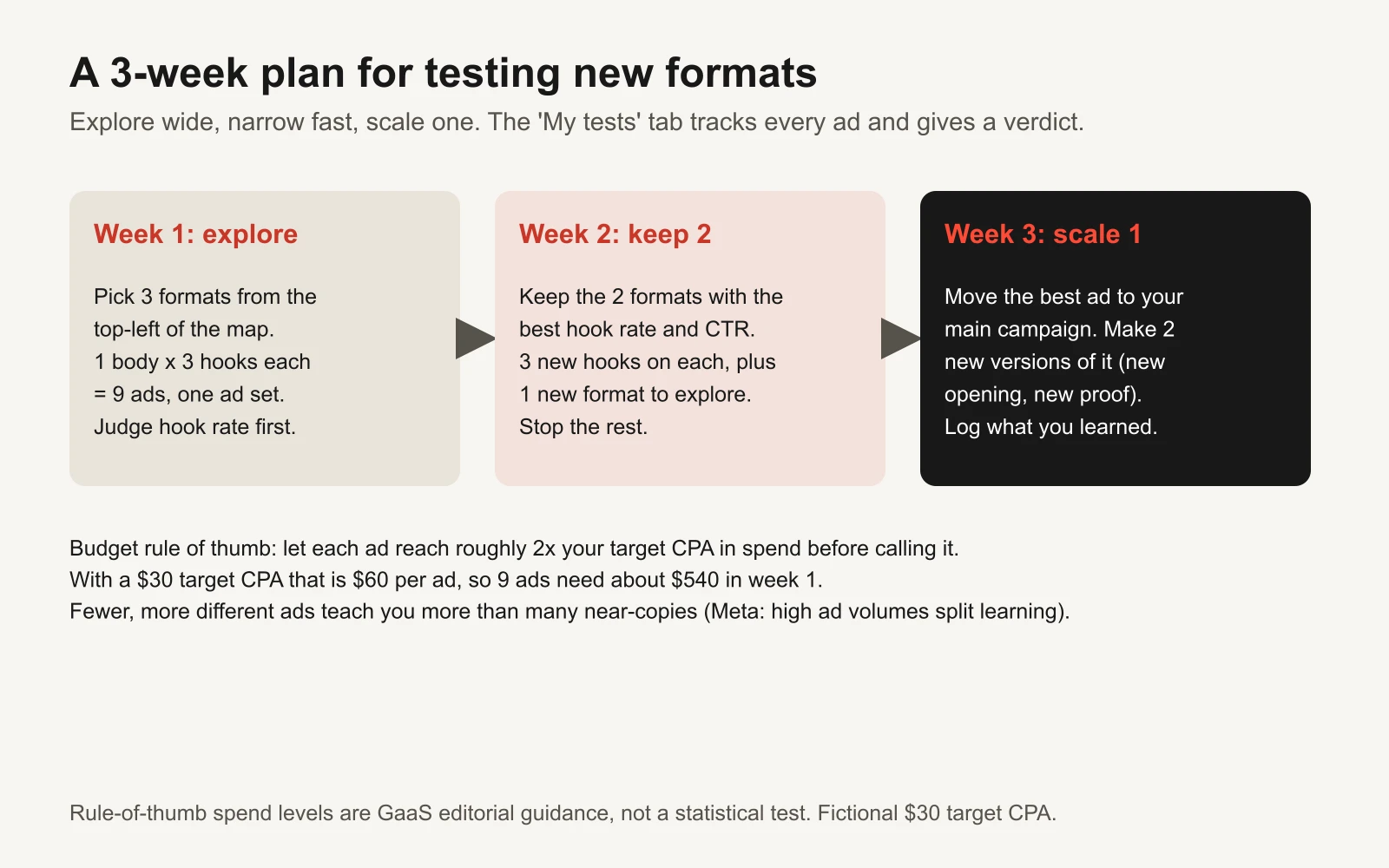
Explore wide, narrow fast, scale one. The workbook's verdict column waits until each ad has spent enough to judge.
Rules that keep tests readable:
- One body, three hooks. For each format, write three openings using the hook template and attach them to the same body. If one opening wins clearly, you learned about hooks. If all three lose, you learned about the format.
- Judge in order. Hook rate first (does it stop people?), then CTR (does it make them act?), then CPA and ROAS (does it make money?). An ad can fail early for a cheap reason you can fix.
- Give each ad enough spend. A common rule of thumb is to let each ad spend about twice your target CPA before deciding. Below that, one lucky or unlucky sale decides the result. The workbook says "Too early" until an ad crosses the minimum you set. This is a practical rule, not a statistical test; for a controlled experiment use the creative testing template.
- Fewer, more different ads. Meta says that when you create many ads and ad sets, its delivery system learns less about each one (Meta: About the learning phase). Nine ads from three genuinely different formats teach you more than thirty near-copies.
- Write down what you learned. One line per test in the tracker ("problem-first hooks beat product-first hooks for this product") is worth more than the spreadsheet of numbers. The creative taxonomy template shows how to tag ads so learnings add up over time.
Here is how the tracker reads two fictional tests for a coffee grinder brand with a $30 target CPA and a 2.0 target ROAS:
| Test | Format | Spend | Hook rate | Purchases | ROAS | Verdict |
|---|---|---|---|---|---|---|
| T-001 | 12. Problem-agitate-solve: "If your coffee tastes bitter at home, it's not your fault." | $180 | 29% | 7 | 3.42 | Good: scale or iterate |
| T-002 | 38. Notes app list: "Things I stopped buying after I found this grinder:" | $45 | n/a (static) | 1 | 1.96 | Too early (minimum $60) |
Policy and honesty guardrails
Several formats sit close to rules that can get an ad rejected or a business in trouble. A short list to check before you publish:
- Fake interface elements. Meta's advertising standards ban images showing functionality that doesn't exist, such as play buttons, notification badges or checkboxes that don't work (Meta: non-existent functionality). That matters for text-chat, notes-app and social-post formats.
- Reviews and testimonials. In the US, the FTC's rule on consumer reviews and testimonials makes it unlawful for a business to create or sell reviews that misrepresent the reviewer or their experience (16 CFR 465). Use real reviews, with permission.
- Reference prices. A "was" price or price anchor should be a genuine former price (FTC Guides Against Deceptive Pricing, 16 CFR 233).
- Before-and-after and health claims. Many categories have extra rules for these. Check Meta's Advertising Standards and Google's ad policies for your category first.
- Music and footage. Trending audio in organic posts is often not licensed for ads. Use a commercial library.
- People. Get signed releases from everyone who appears, and never imply an expert or celebrity endorsement you don't have.
Tools and repos for making formats faster
| Tool or repo | What it is for | Who should use it |
|---|---|---|
| Meta Ad Library | Browse active ads by keyword or advertiser, filter by active status and media type | Everyone, before every shoot |
| facebookresearch/Ad-Library-API-Script-Repository | Meta's example scripts for the Ad Library API. The API covers ads about social issues, elections or politics, plus ads of any type delivered in the UK or EU (Meta: Ad Library API) | Researchers and marketers studying UK or EU ads at scale |
| remotion-dev/remotion | Make videos with code (React), so one template becomes many versions | Teams producing offer cards, countdowns and comparison videos in volume |
| heygen-com/hyperframes | Write HTML, render it as video; built for AI agents to drive | Anyone who wants an assistant to build motion-graphic formats |
| openai/whisper and ggml-org/whisper.cpp | Open-source speech recognition for burned-in captions | Talking-head and UGC formats, where most people watch with sound off |
| Zulko/moviepy | Video editing in Python: cut, add text, stitch hooks onto one body | Marketers making three-hook versions of one video |
| anthropics/skills | Public agent skills, including an xlsx skill that lets Claude read and filter this swipe file | Anyone who wants an assistant to suggest formats from the workbook |
Or let GaaS make the tests
GaaS is an AI agent that makes, launches and optimizes Meta and Google ads from your website, a spend limit and a one-line goal. It has made 60,000+ ads, picks formats to test for your product, writes the hooks, and reads the results, and nothing spends without your approval. If you'd rather review ads than make them, see how GaaS works. The swipe file is yours either way.