
The most-funded ad format on Meta isn't a video. It's a static banner with an offer on it.
That's from Motion's Creative Benchmarks 2026, a study of 578,750 Meta ads. A plain image with a clear offer, the kind a business owner can make in an afternoon, took more of the money than any other format. And while video gets the attention, a static is the cheapest ad you can test: no shoot, no editor, no waiting a week.
This post gives you 40 static layouts, grouped by the job each one does, plus the rules we use to fill them and test them. The workbook has the specs for every layout to rebuild in Figma or Canva with your own product photos, a copy builder that drafts a headline for all 40 from nine facts about your product, and a tracker that tells you which layouts to keep.
What the data says about statics
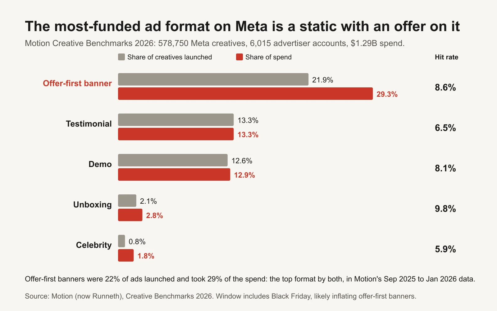
Source: Motion (now Runneth), Creative Benchmarks 2026. Hit rate is the share of creatives that became winners in Motion's definition.
Motion analysed 578,750 Meta creatives from 6,015 advertiser accounts, with $1.29 billion in spend, launched between September 2025 and January 2026. In its format leaderboard (Motion: top visual formats):
- Offer-first banners were 21.9% of creatives and took 29.3% of spend, the top format by both. 8.6% of them became winners.
- Testimonials were 13.3% of creatives and 13.3% of spend; demos 12.6% and 12.9%.
- Among the formats that got more spend than their share of launches, Motion names Letter and Post-It alongside Celebrity and Unboxing: plain, low-production formats.
Two honest caveats. First, Motion itself warns that the window includes Black Friday and Cyber Monday, which probably inflates offer-first banners compared with a normal month. Second, Motion doesn't split static against video by cost, so this doesn't prove statics are "cheaper winners". It shows that a simple static with a clear offer is where a lot of real money goes. (Motion's site now redirects to Runneth; the pages still carry Motion's name.)
A "winner" in Motion's data is rare: roughly 5% of creatives spend at least 10 times their account's median (Motion: winners are rare). That's the real argument for statics. If only about 1 in 20 ads becomes a winner, the format you can make 20 of this week has an advantage.
40 layouts, grouped by the job they do
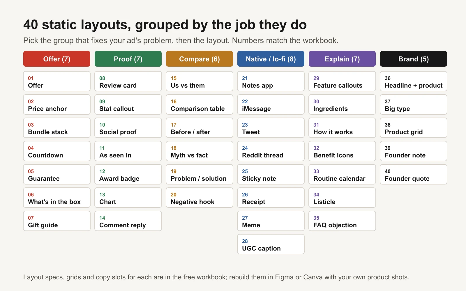
Numbers match the Layouts tab in the workbook.
Don't pick a layout because it looks good. Pick it for the problem your ad has:
| Group | Use it when | Start with |
|---|---|---|
| Offer (7) | You have a real offer and people already know you | Offer, Price anchor, Guarantee |
| Proof (7) | People doubt it works or doubt you | Review card, Stat callout, Social proof |
| Compare (6) | Buyers use something else today | Us vs them, Problem / solution, Myth vs fact |
| Native / lo-fi (8) | Polished ads get scrolled past | Notes app, Sticky note, iMessage |
| Explain (7) | The product is new or unusual | How it works, Feature callouts, Ingredients |
| Brand (5) | You need one solid default | Headline + product, Big type |
The workbook's Layouts tab lists all 40 with when to use each, its structure, and a build note (for example: "Strike the full price in grey; offer price in your accent colour" for Price anchor, or "Native screenshot look; no logo in the header" for Notes app).
A few layouts come with rules attached. Before / after images are restricted for some claims, such as health and weight loss, under Meta's advertising standards; check before you run one. "As seen in" and "Award badge" are only for coverage and awards you actually have. Anything that looks like a real post, message or review (Tweet, Reddit thread, Comment reply, Review card) must be real and used with permission, or obviously your own illustration.
Every layout fills the same four slots
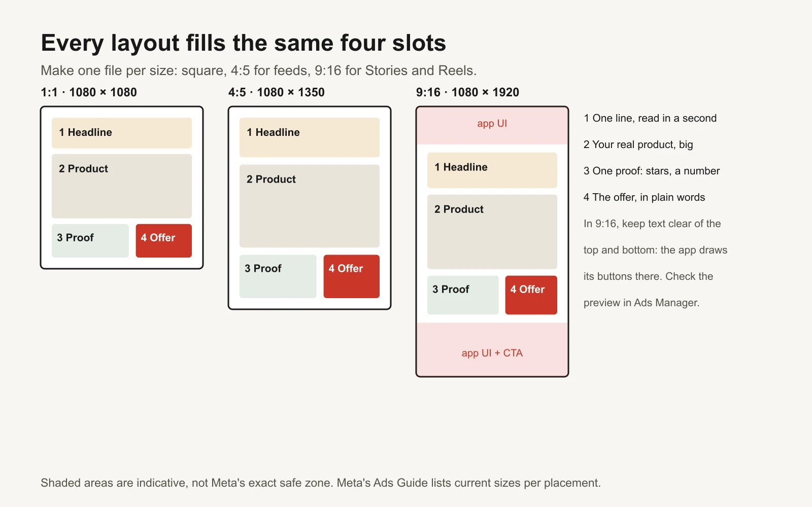
Shaded areas are indicative; check the placement preview in Ads Manager.
However different they look, all 40 layouts fill four slots:
- Headline. One line someone can read in a second. Benefit, problem or offer.
- Product. Your real product, big. Use your own photos; a flat background works.
- Proof. One thing that makes the headline believable: a star rating, a number, a short quote.
- Offer. What they get, in plain words, or a clear next step.
Build at 1080 x 1350 (4:5) first, because it takes the most room in Facebook and Instagram feeds. Then make 1080 x 1080 (1:1) and 1080 x 1920 (9:16) for Stories and Reels from the same file. In 9:16, keep text and logos away from the top and bottom, where the app draws its own buttons, and check the preview in Ads Manager. Meta's Ads Guide lists the current specs per placement.
In Figma, make one frame per size and use auto layout so the four slots reflow. In Canva, make the 4:5 design first and use Resize for the others. Either way, once a layout is built, a new ad is a new headline and a new photo.
Write the copy for all 40 in one go
The workbook's Copy builder asks for nine facts: your brand, product, main benefit, the problem it fixes, one proof you can back up, your offer, a real review with the reviewer's name, what people use instead, and your prices and guarantee. It then drafts a headline and a second line for every layout.
In the fictional example (a brand called Northfield selling greens gummies), the Us vs them layout gets "Northfield vs greens powder in a tub", Problem / solution gets "Tired of the 3pm crash?", and Price anchor gets "$40 → $32".
Treat these as first drafts. Rewrite the ones you'll use in your own voice, and check every claim: a stat callout needs a number you can show on your landing page, and a review card needs a real review used with permission. The ad hook bank has more headline patterns to try in the headline slot.
Test layouts first, then words
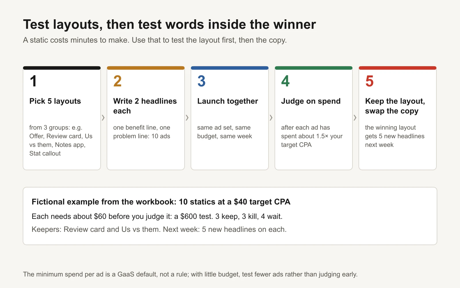
The minimum spend per ad is a GaaS default, not a rule.
- Pick 5 layouts from at least 3 groups. Different groups test different reasons to buy.
- Write 2 headlines for each. One benefit line, one problem line. That's 10 ads.
- Launch them together, in the same ad set with the same budget, so they compete on equal terms.
- Judge on spend, not days. Wait until each ad has spent about 1.5 times your target CPA (cost per acquisition). Below that, a single purchase swings the numbers. The Test tracker marks each ad keep, kill or too early.
- Keep the layout, swap the words. Next week, put 5 new headlines into the winning layout. That's how one good static becomes ten.
In the workbook's fictional example, 10 statics at a $40 target CPA need about $60 each before you judge them: a $600 test. Three are keepers (both Review cards and one Us vs them), three are kills and four need more spend. If $600 is too much, test fewer layouts rather than judging early. The creative testing budget calculator works out the numbers for your account.
What's in the workbook
- Layouts: all 40, grouped, with when to use each, the structure and a build note.
- Copy builder: nine facts in, a draft headline and second line out for every layout.
- Test tracker: 10 example ads (fictional), CPA per ad, a keep / kill / too early verdict against your target, and a chart of purchases by layout.
- Sizes: 4:5, 1:1 and 9:16 export sizes and where each runs.
These are specs to rebuild in your own design tool, not Figma or Canva files: you'll use your own product photos, fonts and colours, which is what makes a static look like yours.
Tools and repos that help
| Tool or repo | What it is for | Who should use it |
|---|---|---|
| Figma | Build each layout once as a frame with auto layout, then swap text and photos | Designers, or anyone making many variants |
| Canva | Build a layout, then Resize for 1:1 and 9:16 | Business owners without a designer |
| Meta Ads Guide | Current image sizes and specs per placement | Everyone, before exporting |
| Motion Creative Benchmarks 2026 | Which formats get launched and funded across 578,750 Meta creatives | Anyone choosing formats |
| anthropics/skills | Public agent skills, including an xlsx skill so Claude can fill in the copy builder or tracker | Anyone who wants an assistant to draft headlines |
Or let GaaS run it
GaaS is an AI agent that creates, launches and optimizes Meta and Google ads from three inputs: your website, a spend limit and a one-line goal. It writes and designs statics from your own product photos, tests them in batches and keeps what earns, and nothing spends without your approval. See how GaaS works. Either way, the 40 layouts are yours to keep.